|
|
Post by Old School on Aug 5, 2015 13:58:31 GMT -8
Indeed. Better to look good and win, than look good and lose.
Oldie Out
|
|
|
|
Post by uncledougy on Aug 5, 2015 15:23:37 GMT -8
Played with Photoshop, came up with a little somethin', somethin'. 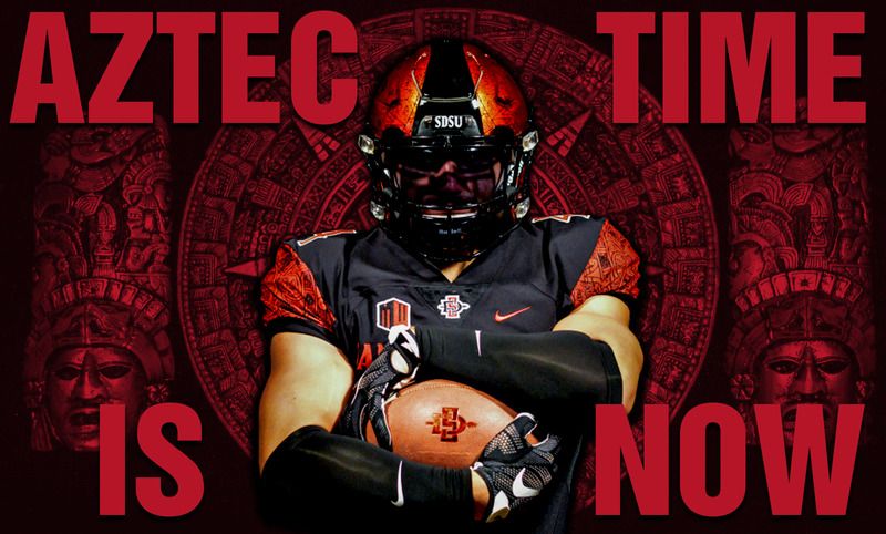 Oldie Out AWESOME! New masthead? |
|
|
|
Post by tonatiuh on Aug 5, 2015 17:17:44 GMT -8
I'm fine with the new uniforms, but the most important thing to me is that they reflect an apparent willingness by the administration to embrace the Aztec name and do so proudly rather than walking on egg shells for fear of PC backlash over use of the name. I continue to believe that orientation for every incoming student and staff member should include an introduction to SDSU's historic use/interpretation of Aztec culture as shown in the names of various campus features and its sports teams. It leads further credence to the meaning of being a Aztec for Life! I obviously missed something. Where did you see an attempt to "...embrace the Aztec name and do so proudly..."? I didn't see the word "Aztec" anywhere on the uniforms. MOW, he wasn't talking about the name "AZTECS" on the uniform, but embracing the Aztec culture and name as a whole. The Aztec name is not on the uniforms. |
|
|
|
Post by tonatiuh on Aug 5, 2015 17:23:04 GMT -8
Ernie, these are great photos, and I really do like the design they came up with on the helmet, and the unis. I have a question for you just to get your opinion. The detail on the Aztec Calendar on both the helmets, and shoulders is very fine.
Would you say that would make it difficult to notice the detail during a TV game unless they were able to get a close up of a particular player?
|
|
|
|
Post by myownwords on Aug 5, 2015 18:09:45 GMT -8
I obviously missed something. Where did you see an attempt to "...embrace the Aztec name and do so proudly..."? I didn't see the word "Aztec" anywhere on the uniforms. MOW, he wasn't talking about the name "AZTECS" on the uniform, but embracing the Aztec culture and name as a whole. The Aztec name is not on the uniforms. Well then. My mistake, thanks. |
|
|
|
Post by aztecvatar on Aug 5, 2015 18:41:16 GMT -8
Yay for the new uniforms! We just picked up 2, maybe 3, new 4-star recruits!
|
|
|
|
Post by giju on Aug 5, 2015 19:47:49 GMT -8
Great looking unis.....
|
|
|
|
Post by csfoster on Aug 6, 2015 8:08:36 GMT -8
The uniforms look great and it is up to the Aztecs to play that way!  |
|
|
|
Post by leastcoast on Aug 6, 2015 10:22:03 GMT -8
what's nice about the aztec calendar being a part of the uniform design is that from a certain distance it can be read as almost like an abstract pattern.
it isn't just a logo.
like north carolina's use of argyle or kentucky's checker flag motif.
it utilizes intricate drawing that can be placed on trim and has a look of intentional marbling when seen on tv. close up it tells a narrative.
the calendar isn't a grotesque cartoon of a colonized native rather it subtly champions the aztec's advanced culture.
from the pictures released, it looks sharp.
it doesn't look trendy like when amateur graphic designers switch to alternate color palates and enlarge existing logos in photoshop, rather this feels more like an identity that separates sdsu athletics from everyone else.
|
|
|
|
Post by HollywoodAztec on Aug 6, 2015 10:33:26 GMT -8
what's nice about the aztec calendar being a part of the uniform design is that from a certain distance it can be read as almost like an abstract pattern. it isn't just a logo. like north carolina's use of argyle or kentucky's checker flag motif. it utilizes intricate drawing that can be placed on trim and has a look of intentional marbling when seen on tv. close up it tells a narrative. the calendar isn't a grotesque cartoon of a colonized native rather it subtly champions the aztec's advanced culture. from the pictures released, it looks sharp. it doesn't look trendy like when amateur graphic designers switch to alternate color palates and enlarge existing logos in photoshop, rather this feels more like an identity that separates sdsu athletics from everyone else. Well said. |
|
|
|
Post by aztec92 on Aug 6, 2015 10:53:57 GMT -8
My only critique is that they should have done something more unique with the calendar design on the jersey. Something more than just the sleeves. It just seems a bit off to me.
|
|
|
|
Post by dshawfan on Aug 6, 2015 11:33:00 GMT -8
the sleeves remind me of the frilly blouses women used to wear during the 80's. Like the helmet, hate the sleeves. Opened the email from shopaztecs.com, took one look at the new jersey, opened this thread...DEFINATELY a generational thing..(liked the one in the latest 360 magazine, but obviously an old picture). Will add another Aztec mini-helmet to my toy room. But frankly, I'd rather see a 10 win team wearing all black with a plain red helmet than yet another example of the current generation of walking billboards. Again, a generational thing. Speak for yourself. I grew up in the days of Coryell and Gilbert, loved the Red and Black of that era, but these new unis are sweet! |
|


